Product
Web application for an Air Force career training tracker.
Challenge
The Air Force’s legacy training system was disjointed and difficult to navigate. The challenge was to rebuild it into an intuitive, modern web application that better supports how Airmen plan, track, and complete required training.


Objectives
1. Identify user frustrations with the legacy system
2. Understand the training process and stakeholder ecosystem
3. Benchmark industry standards for usability and performance

Research
Interviews
Conducted stakeholder and SME interviews with Training Managers and Airmen to uncover needs, goals, and workflow challenges.
Research
Legacy App Review
Analyzed legacy ARMA app user flows to identify usability pain points and gaps in the current training process.
Research
Competitive Analysis
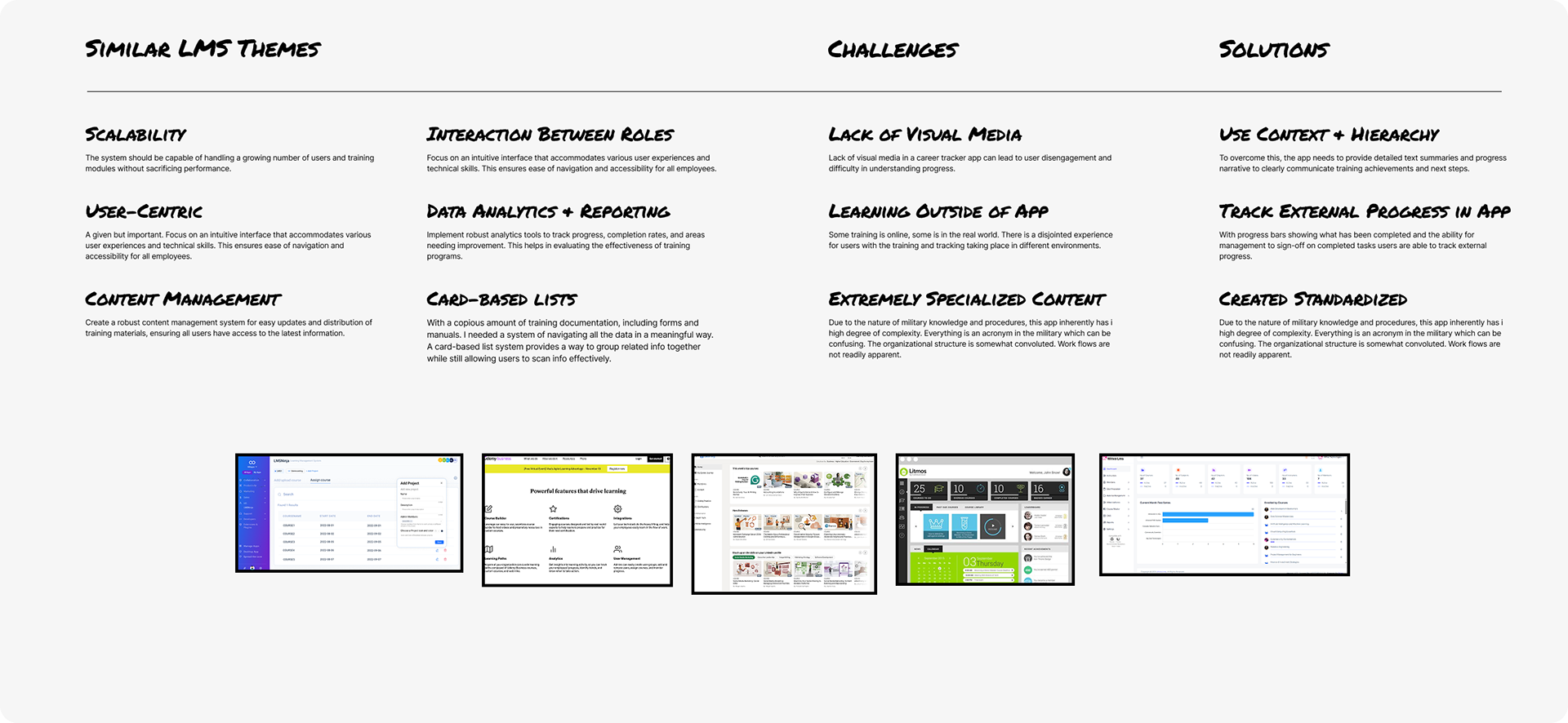
Performed a competitive analysis of modern learning management systems (LMS) to gather insights and best practices for redesign.
Research
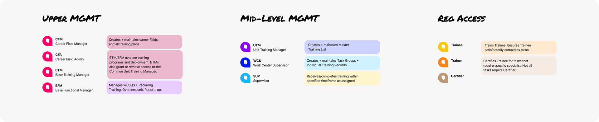
Identify Roles
Mapped user roles and workflows for Admins, Supervisors, and Airmen to clarify interactions, permissions, and task dependencies across the system.

Insights
1. Inconsistent workflows across units create confusion and inefficiency.
2. Limited visibility of current training materials forces users to reference external sources.
3. Cumbersome role switching slows task completion for multi-role personnel.
4. Duplicate data entry increases workload and error risk.
5. Supervisor overload results from Airmen being unable to manage their own profiles.


Problem Statement
“How might we enable Airmen and supervisors to easily assign, track, and complete required training within a unified, intuitive system?”

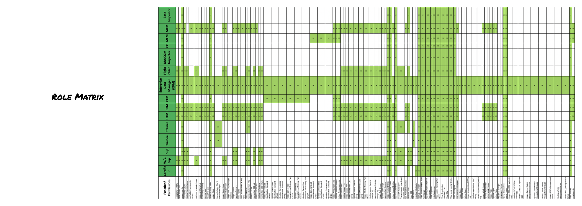
Matrix
The Roles Matrix was helpful in defining permissions for each role.
Synthesis
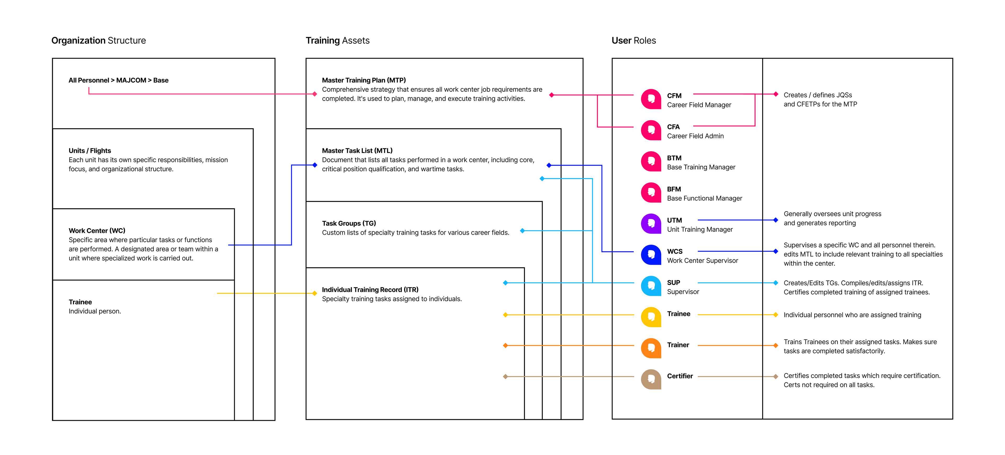
Relationship Mapping
Delving further into the target audience, I mapped associations between user roles and corresponding information with which they interact.
Synthesis
Themes
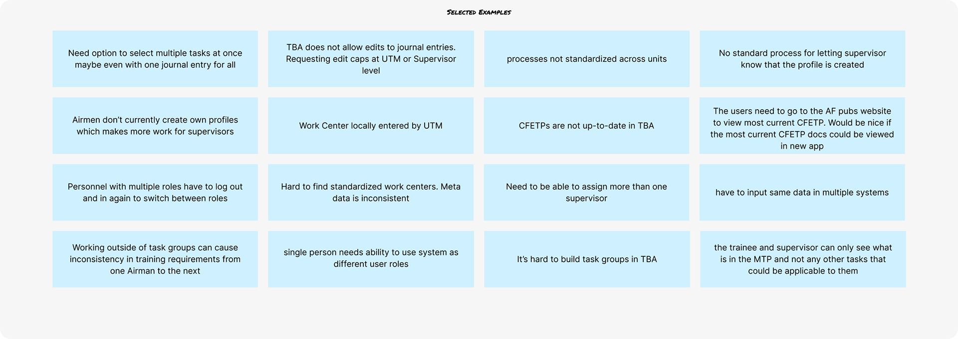
Grouped findings from interviews and pain points into themes
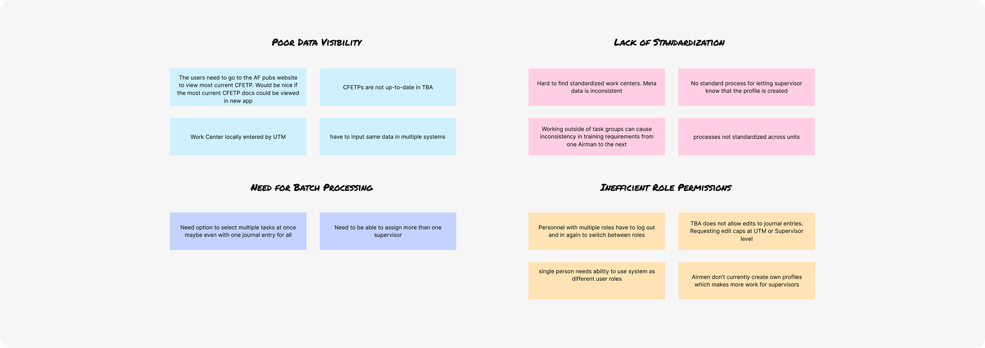
Poor Data Visibility
Airmen and supervisors struggled to understand training progress and upcoming requirements at a glance. Information was scattered, making status tracking inefficient and error-prone.
Need for Batch Processing
Batch processing tasks such as assigning or authorizing completed tasks could speed up repetitive processes.
Complex Workflows
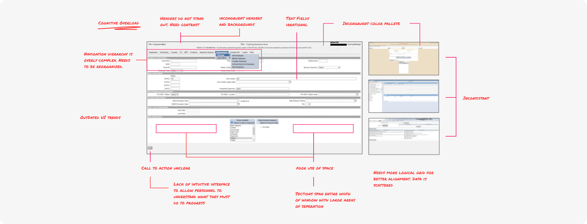
The legacy system required multiple steps and unclear navigation paths, leading to confusion and incomplete task submissions.
Inefficient Role Permissions
Overlapping or unclear permissions created bottlenecks for supervisors and administrators when assigning or verifying tasks.
Lack of Standardization
The interface lacked hierarchy, visual clarity, and standard processes, contributing to user frustration and reduced engagement.
Manual Tracking Dependencies
Users often relied on spreadsheets or offline notes to track completion, highlighting the need for a unified digital experience.

Design Goals
1. Simplify the training tracking process
2. Improve task visibility for all user roles
3. Modernize interface for clarity and consistency
4. Reduce time required to assign and complete training


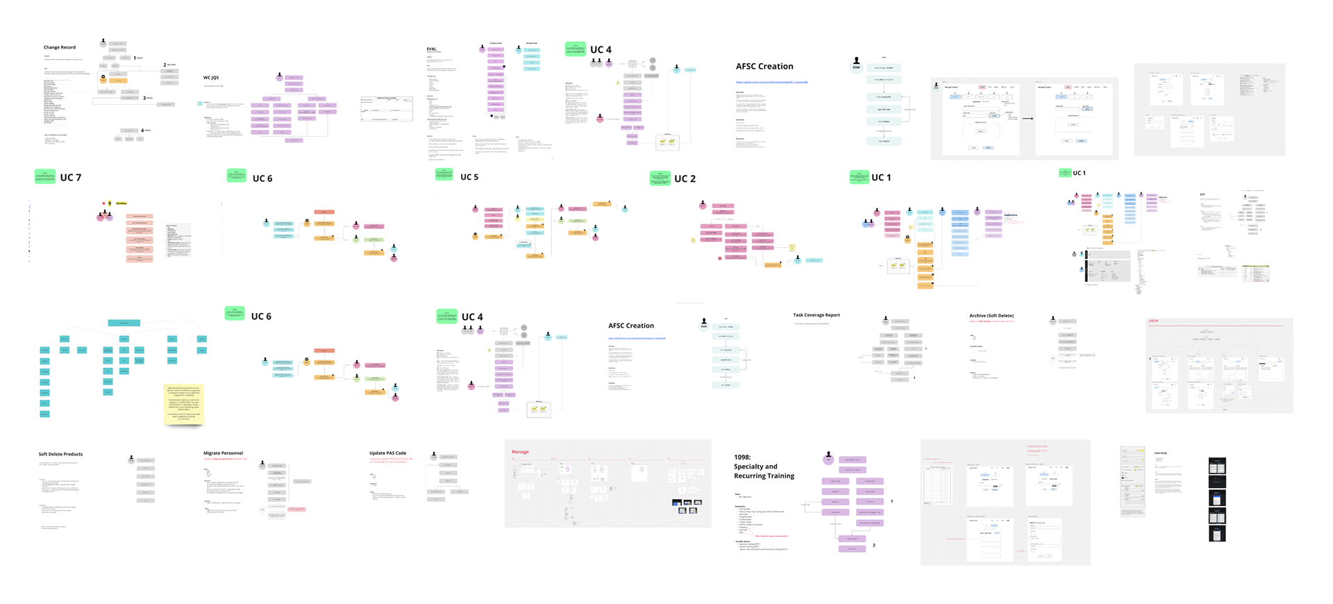
Mapping
Work Flows
There were many different processes I mapped out with the team for various use cases. I was in constant communication with users to understand work flows. Here is a '20 thousand foot view' of some of the flow diagrams.
Mapping
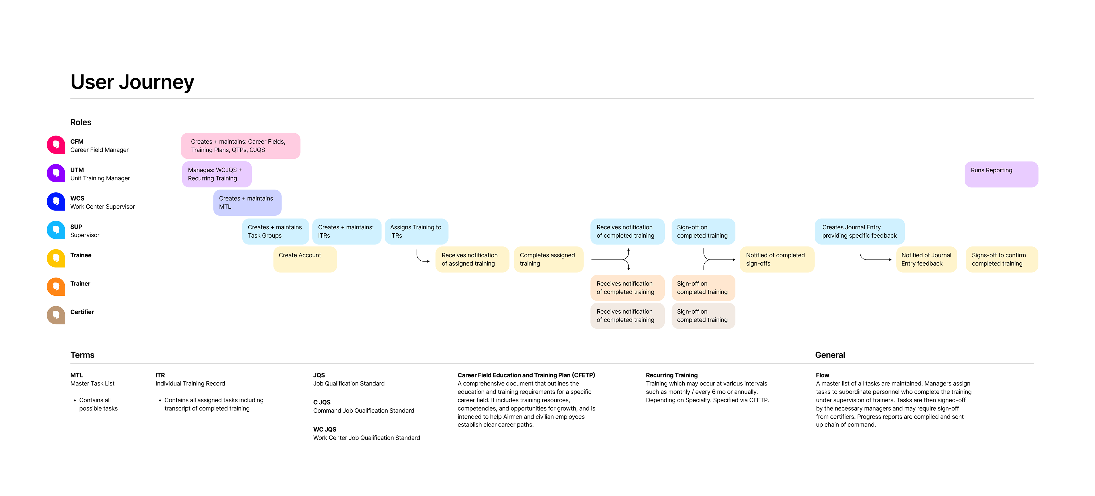
Journey Mapping
I created a journey map to show the correlation and sequencing among roles and events. Complete with synopsis of the high-level flow:
A master list of all tasks are maintained. Managers assign tasks to subordinate personnel who complete the training under supervision of trainers. Tasks are then signed-off by the necessary managers and may require sign-off from certifiers. Progress reports are compiled and sent up chain of command.
A master list of all tasks are maintained. Managers assign tasks to subordinate personnel who complete the training under supervision of trainers. Tasks are then signed-off by the necessary managers and may require sign-off from certifiers. Progress reports are compiled and sent up chain of command.
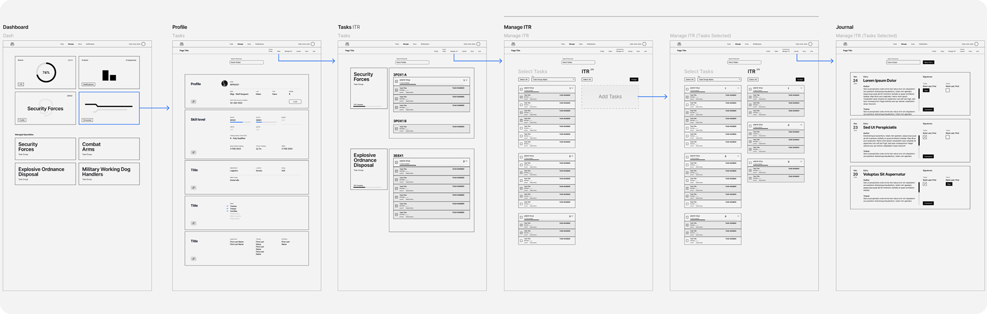
Mapping
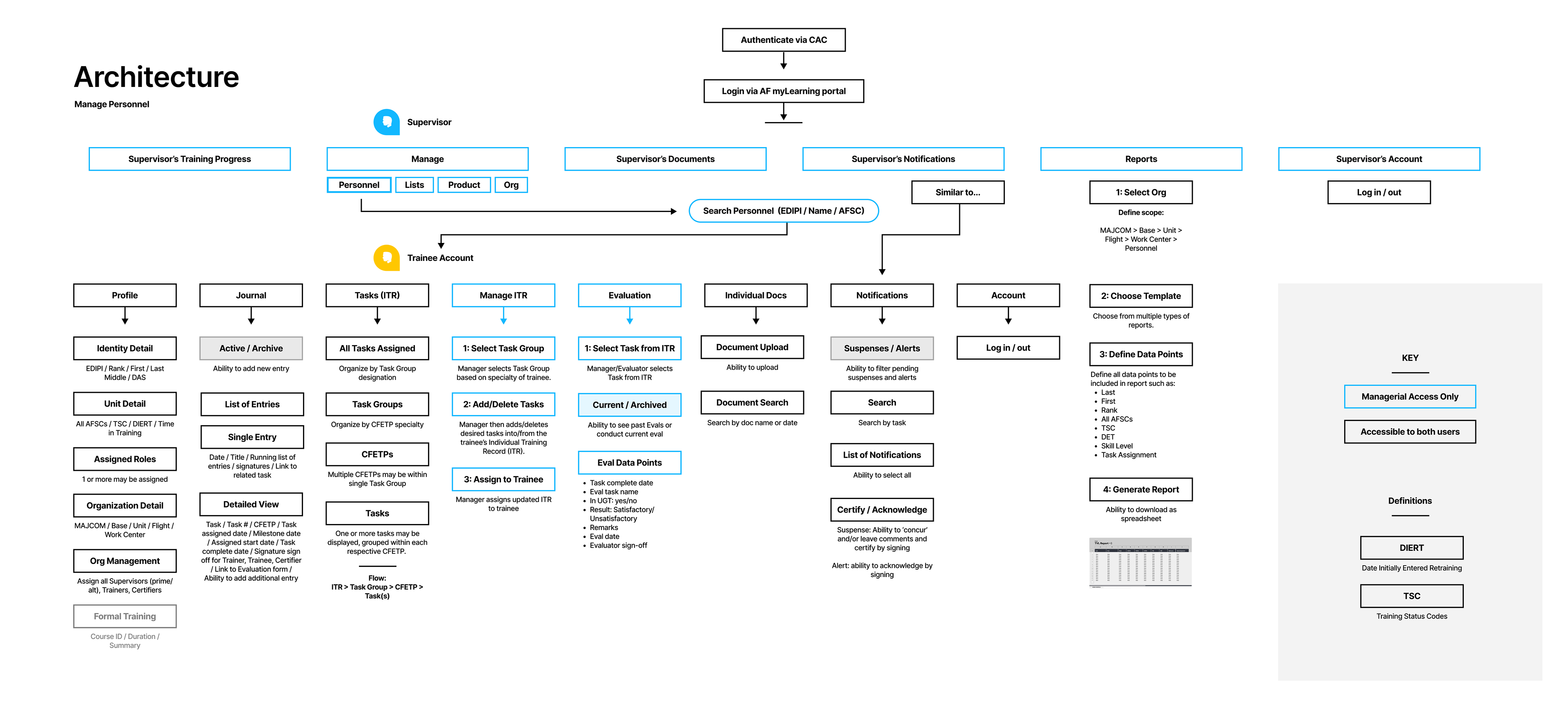
Architecture
Once I understood the data, I was able to map out more structured views–hybrid diagraming of site maps and user flows (below). Since the architecture is displayed differently for different roles, I could show which role had access to which parts of the app and how they would flow together. I made many different diagrams for the various processes that may or may not have involved multiple roles, but the diagrams would define a particular user story or process. They were the maps I could use to get to the wireframes, which would lead to the high fidelity designs.

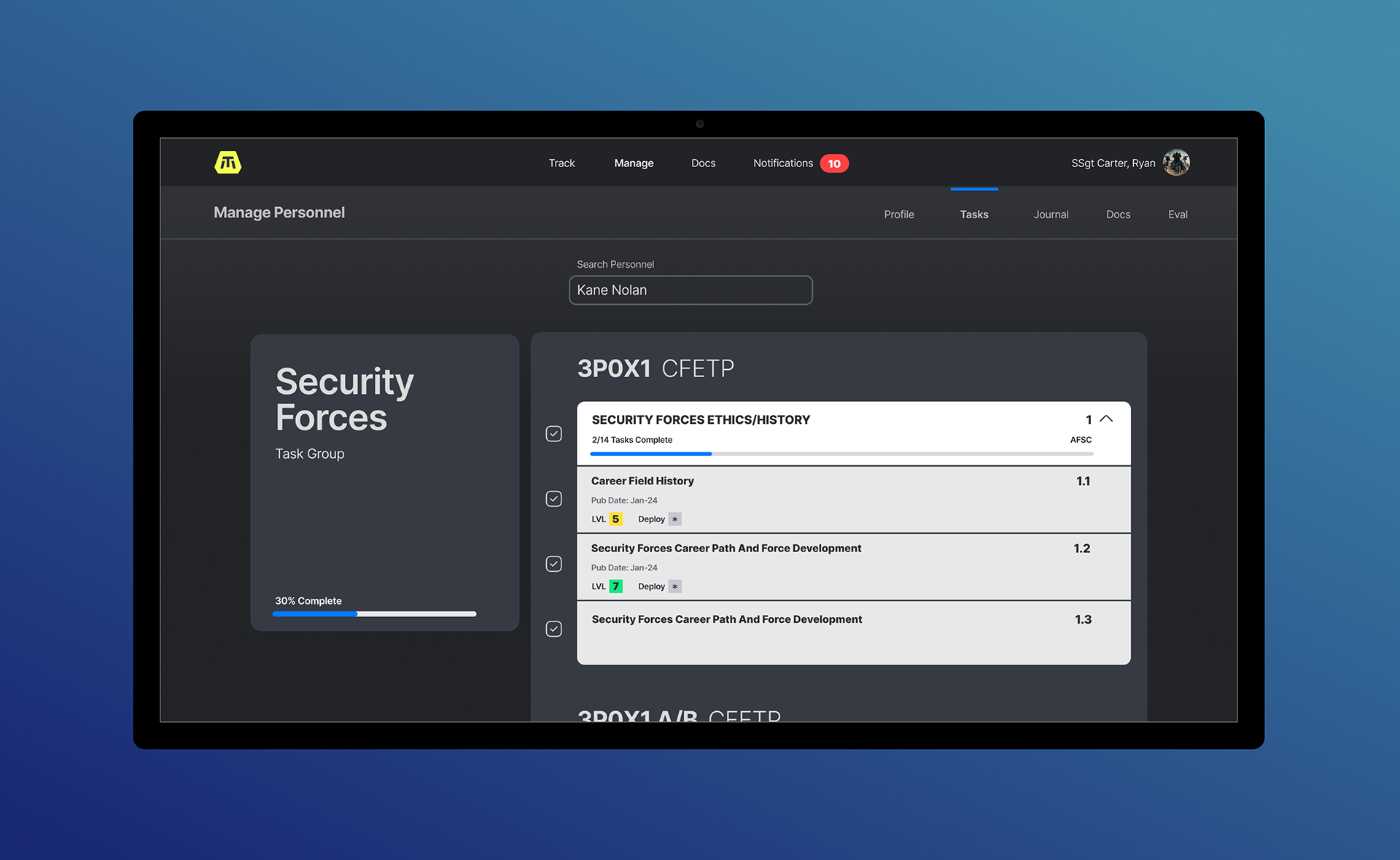
Wireframes
I had enough information to start laying out the design. Starting with wireframes to capture key pages and interactions, I wanted to make sure I was putting all the relevant data points into some kind of layout. It started to take shape.
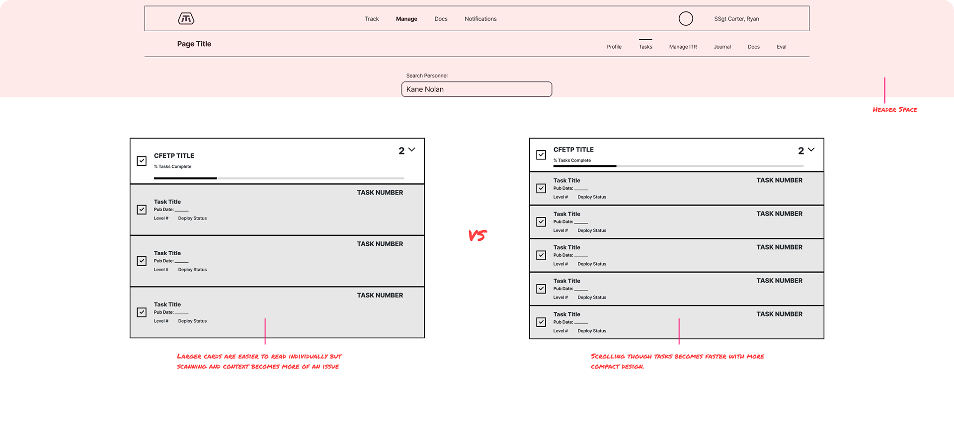
Iteration Example
When designing the card-style collections, my initial instinct was to avoid inducing cognitive overload by making each card large with ample padding for the content to breathe. However, I miscalculated how little space would potentially be visible for the collections due to all other adjacent data which needed to be displayed simultaneously. I had to adjust parameters to accommodate. By condensing the amount of data fit onto each card, it improved scan-ability and contextual awareness.


User Testing
Throughout the wireframe and design process, I would get feedback from the subject matter experts who would ask for adjustments via no-code, interactive prototypes, or green-light our developers to build and push to a staging environment. I would sit in as our QA team user tested each feature by allowing various groups of airmen to interact with staging. They would be asked to accomplish certain tasks and provide feedback. From this I was able to confirm usability of the design, adjusting as necessary. I consistently gathered feedback throughout every step of the project, including high fidelity designs to ensure I was on track and meeting the established goals.

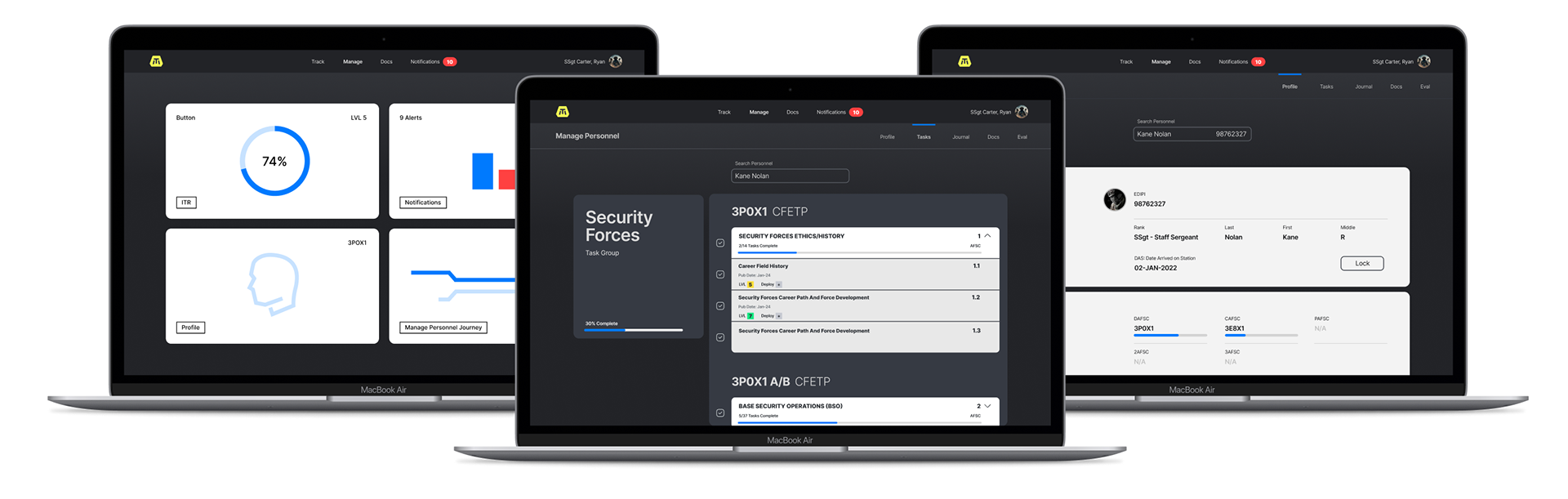
Outcomes
I faced significant challenges due to the prior state of the legacy app and failed attempts to launch a new version, which had left the product in a state of disarray. However, through diligent research, user-centered design, and iterative problem-solving, I was able to create a robust and intuitive design that addressed the previous issues. My design not only rectified the functionality problems but also enhanced the overall user experience. As a result, my team successfully launched the product to a live user base, receiving positive feedback for its improved usability and performance. The project’s successful launch demonstrated the effectiveness of our solutions and contributed to a notable increase in user engagement and satisfaction, ultimately validating the impact of our design improvements.