Overview and Challenge
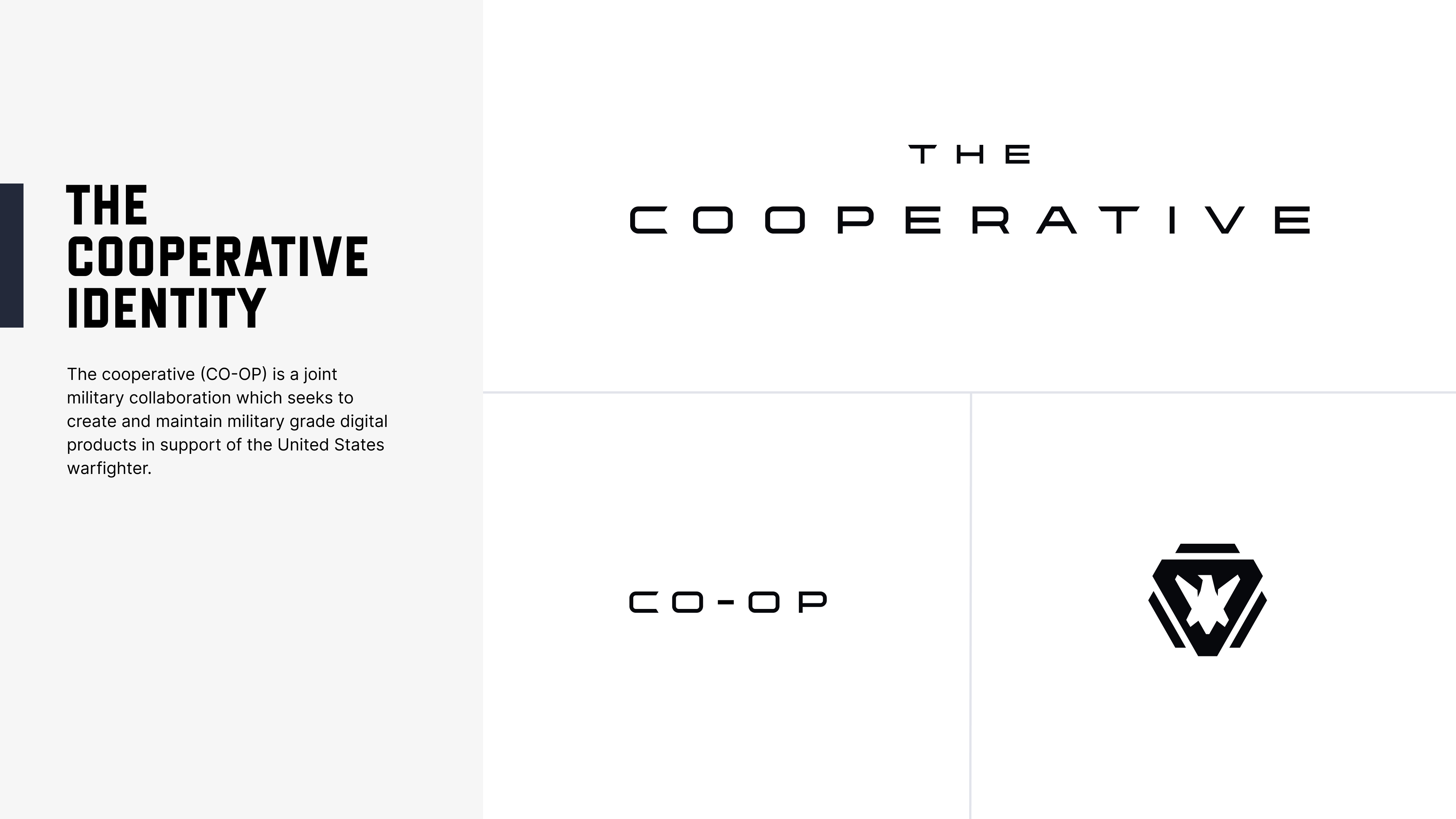
The Cooperative (CO-OP) is a joint military collaboration which seeks to create and maintain military grade digital products in support of the United States warfighter. I was tasked with developing a multi-brand re-brand, bringing several special operations forces application brands into a single, overarching identity. This would strengthen the CO-OP brand as a whole. And, over time, we would reevaluate the UX of each application within the suite. The brand would then also be used as a tool for business development.
Context
Joint military applications are first and foremost created and used for extreme functionality. That is, they are often long-running and/or interdependent systems which do not have a strong emphasis on being user-friendly. Computational efficiency, transaction speed, and system security are paramount whereas the ‘user experience’ is not as high a priority. Often this lack of design leads to apps which do not look or function uniformly. They meet a certain functional requirement but lacks unification.
Research
I explored the collection of applications which served as the basis for the new rebrand. I looked at each system to understand what functionality it entailed and got a general sense the associated brand, which in some cases did not even exist. Some of the apps were connected closely, serving as sort of tandem systems, others were just in the ecosystem. I researched brand systems in the corporate world and larger brands to get ideas on how to approach designing the multi-brand. Companies such as the Adobe, DC and Marvel Comics, Red-Bull, Nike, Tesla, Apple and Microsoft—each of these have multiple brand nested under the main umbrella brand. Since there are so many products they have created and will create in the future, these companies have developed repeatable design themes which can accommodate a wide range of product possibilities. Geometry, iconography, typography, imagery were some of the common themed elements which stood out to me.
Product Promos
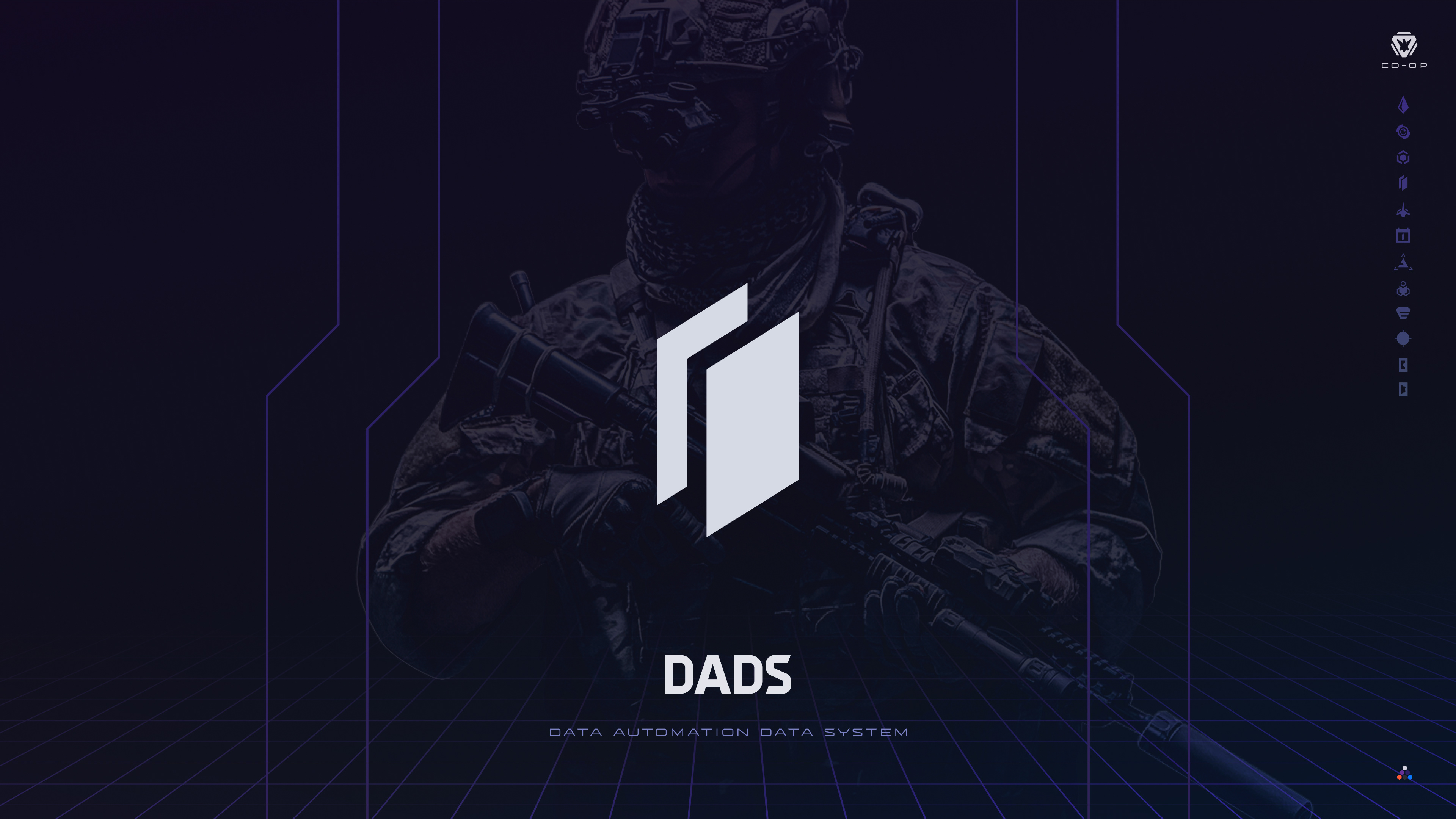
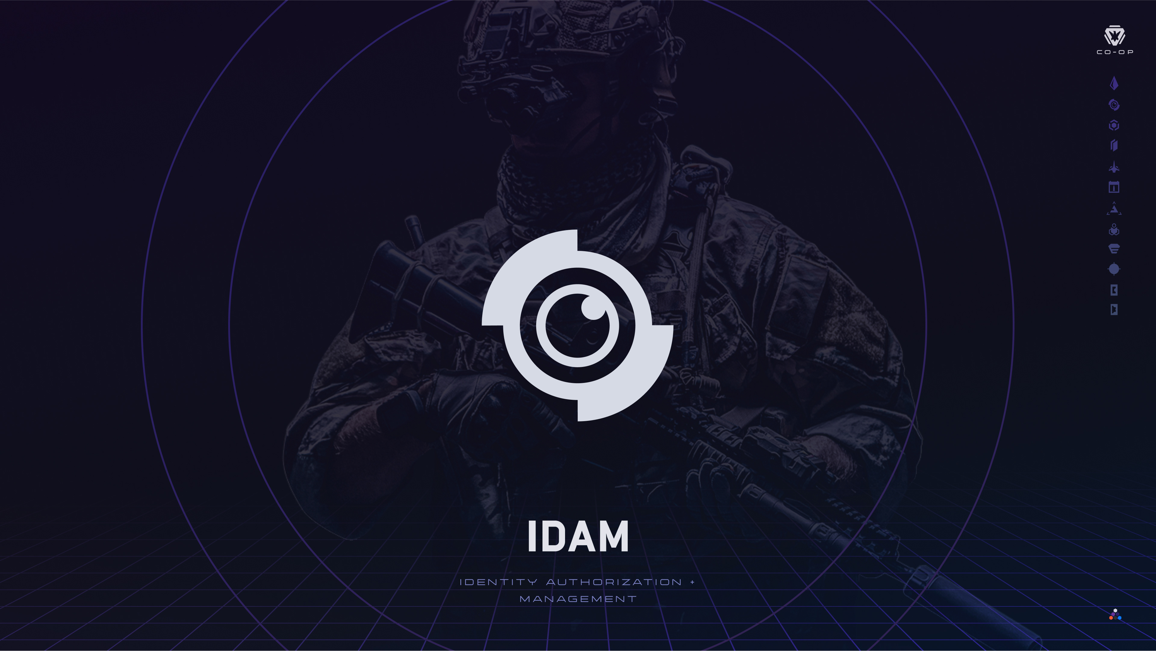
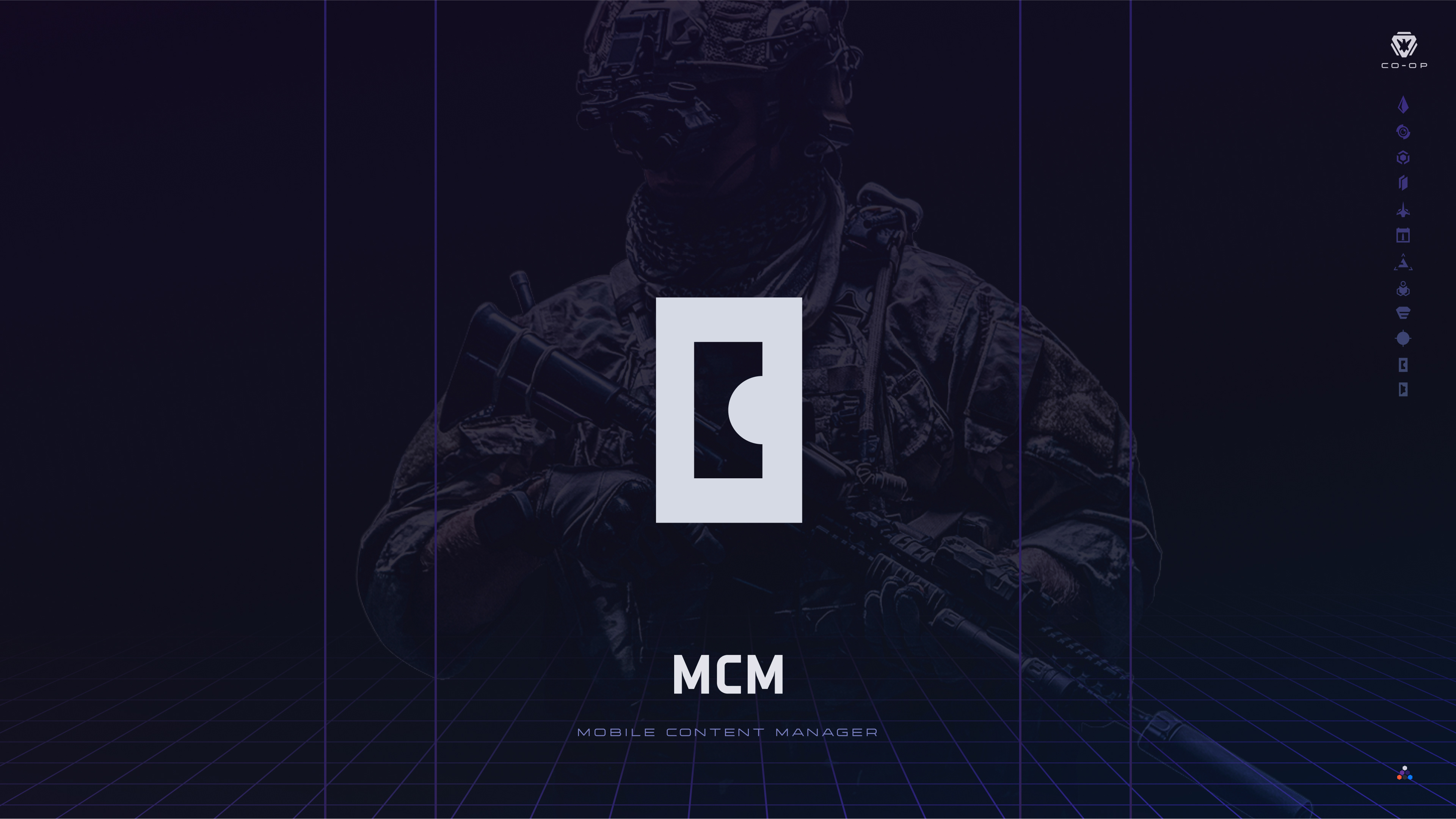
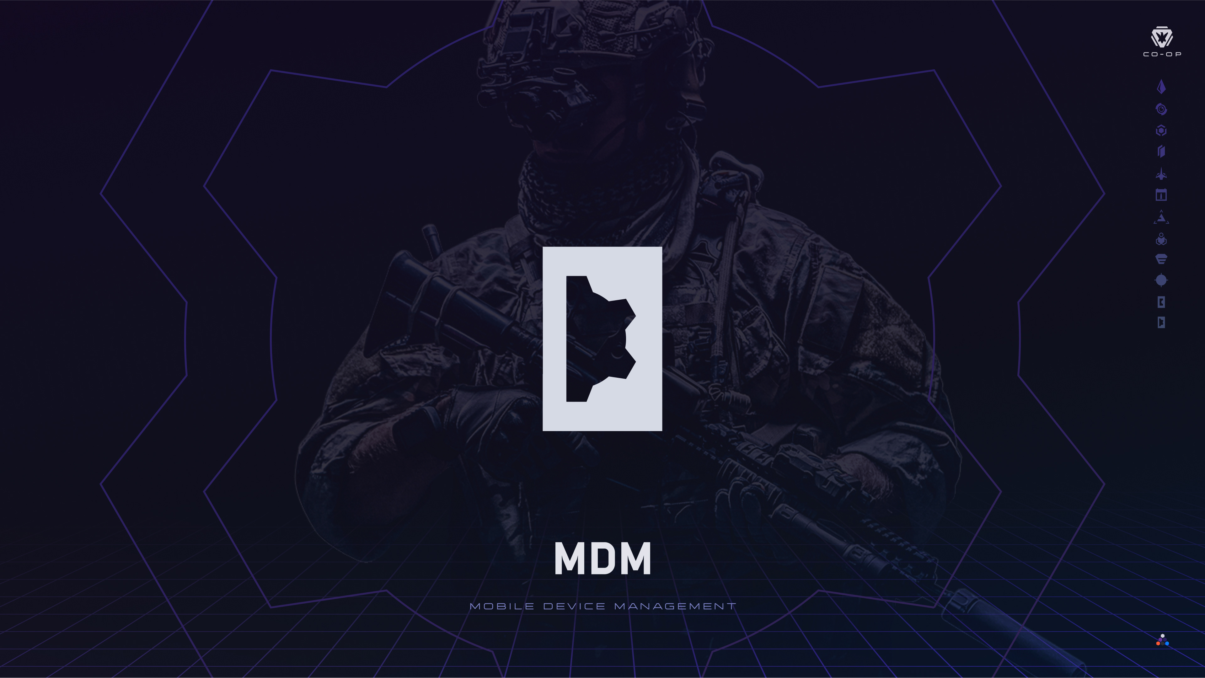
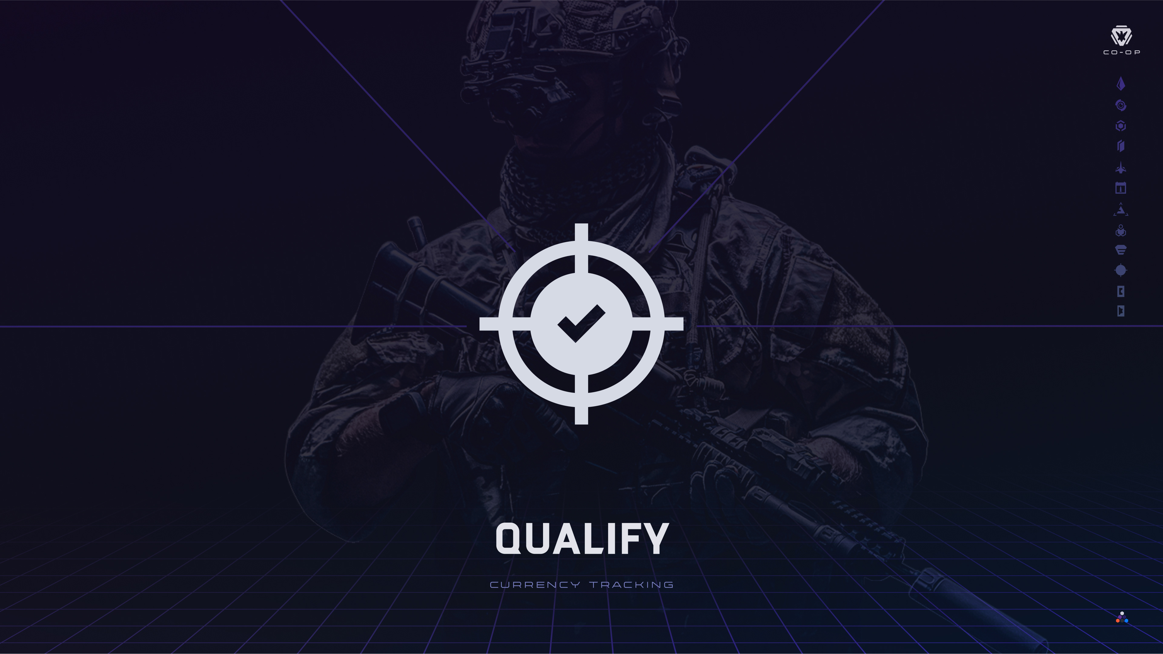
I created promotional material for each product brand. With a uniform background and slight customized accents, each was standardized while also having a custom look.


Brand Guide
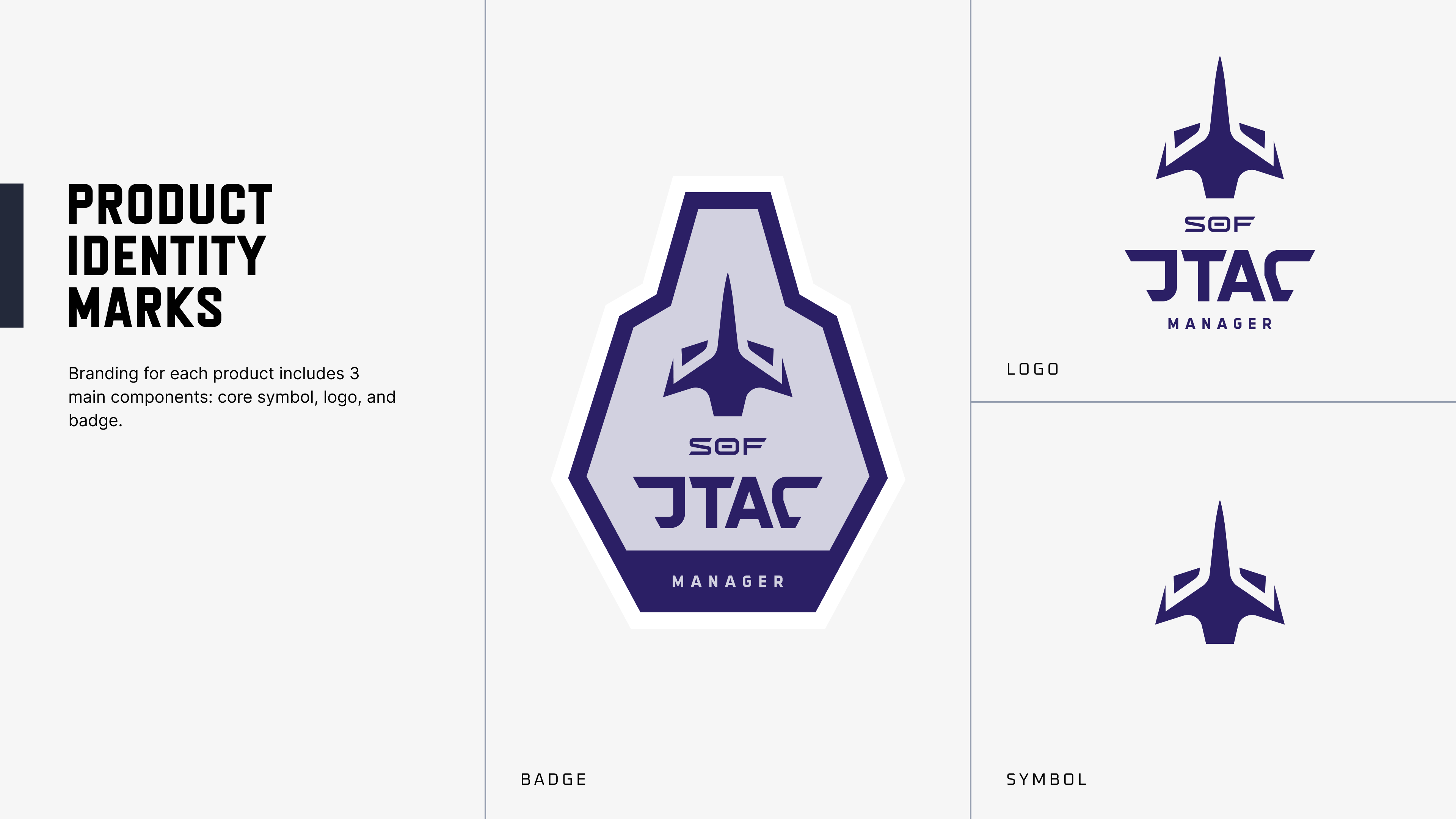
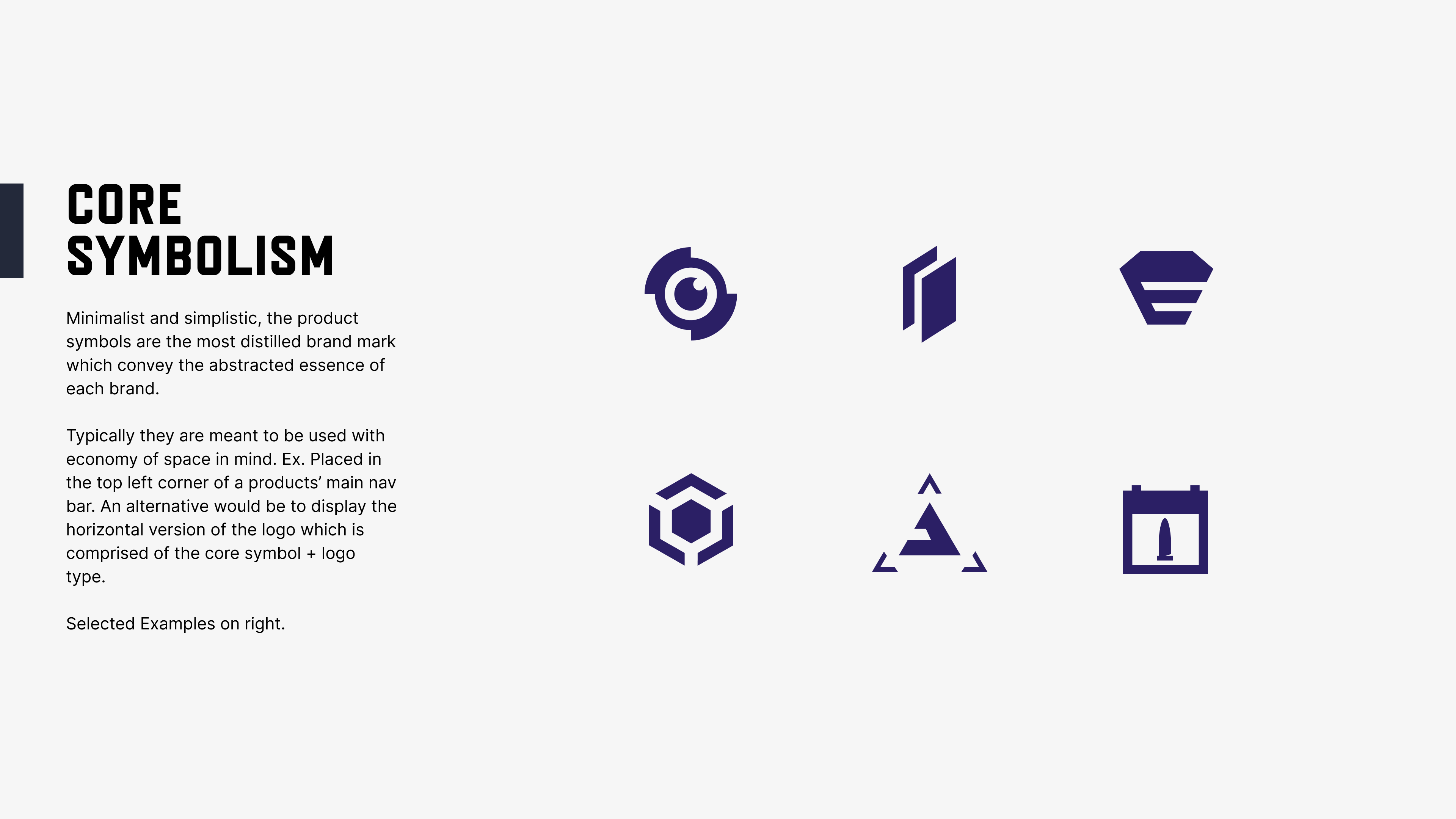
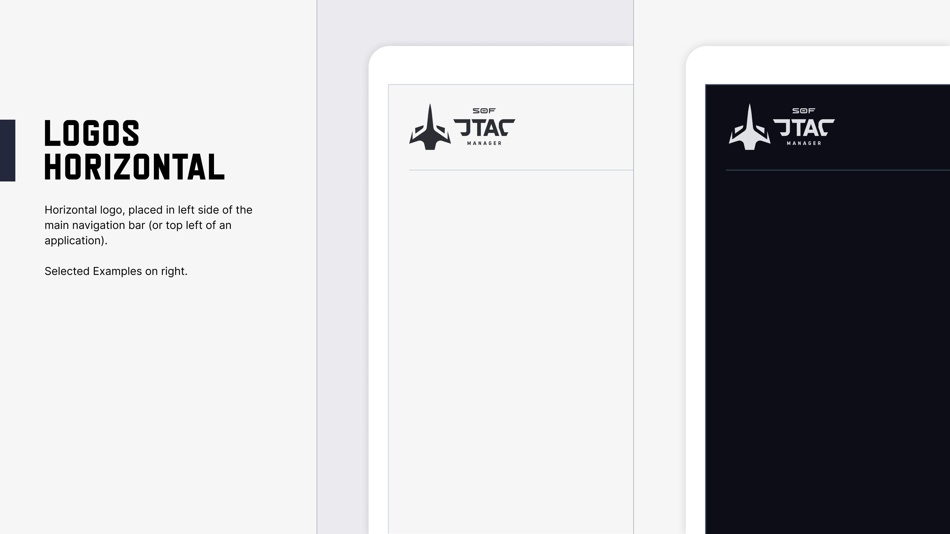
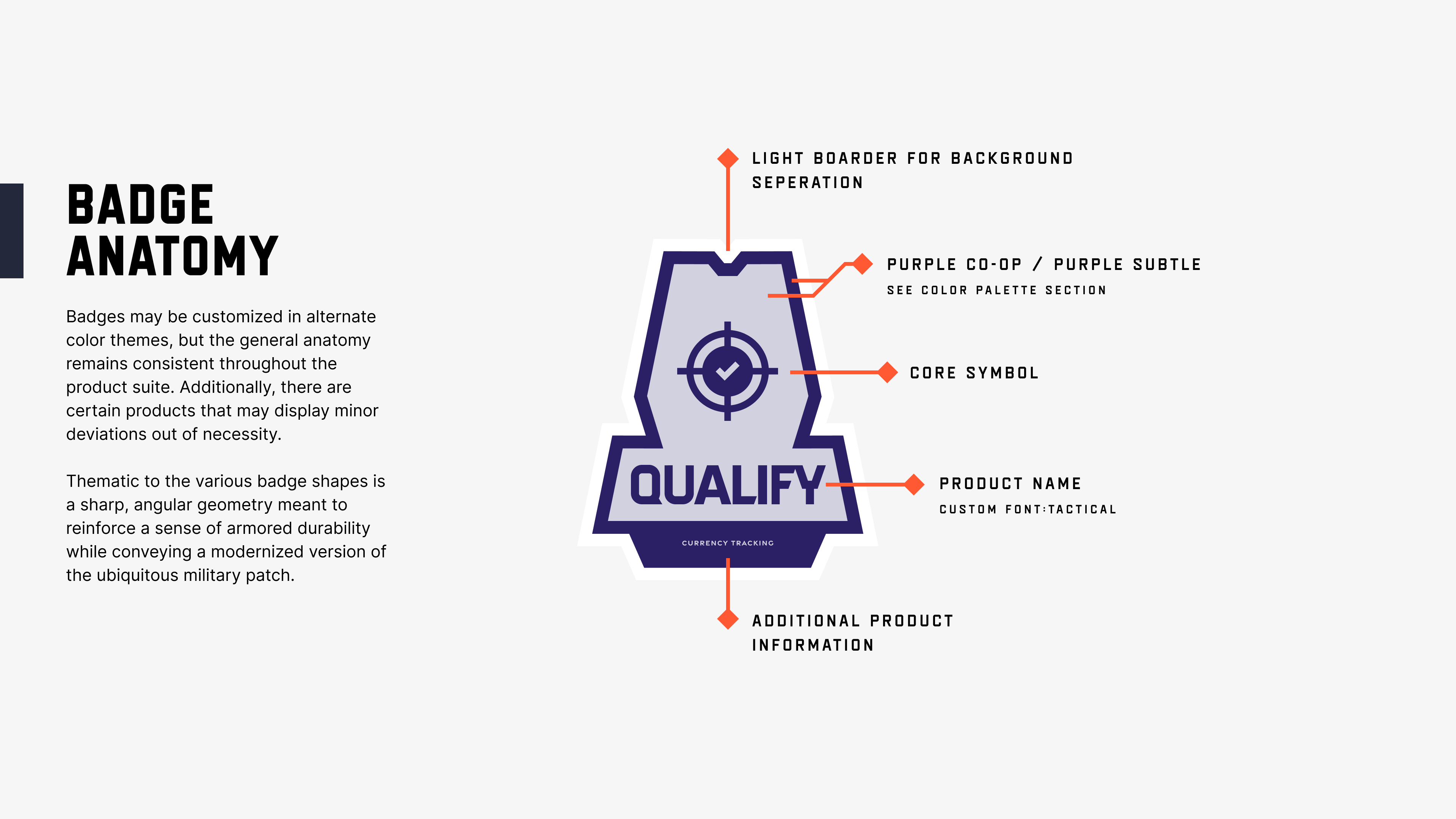
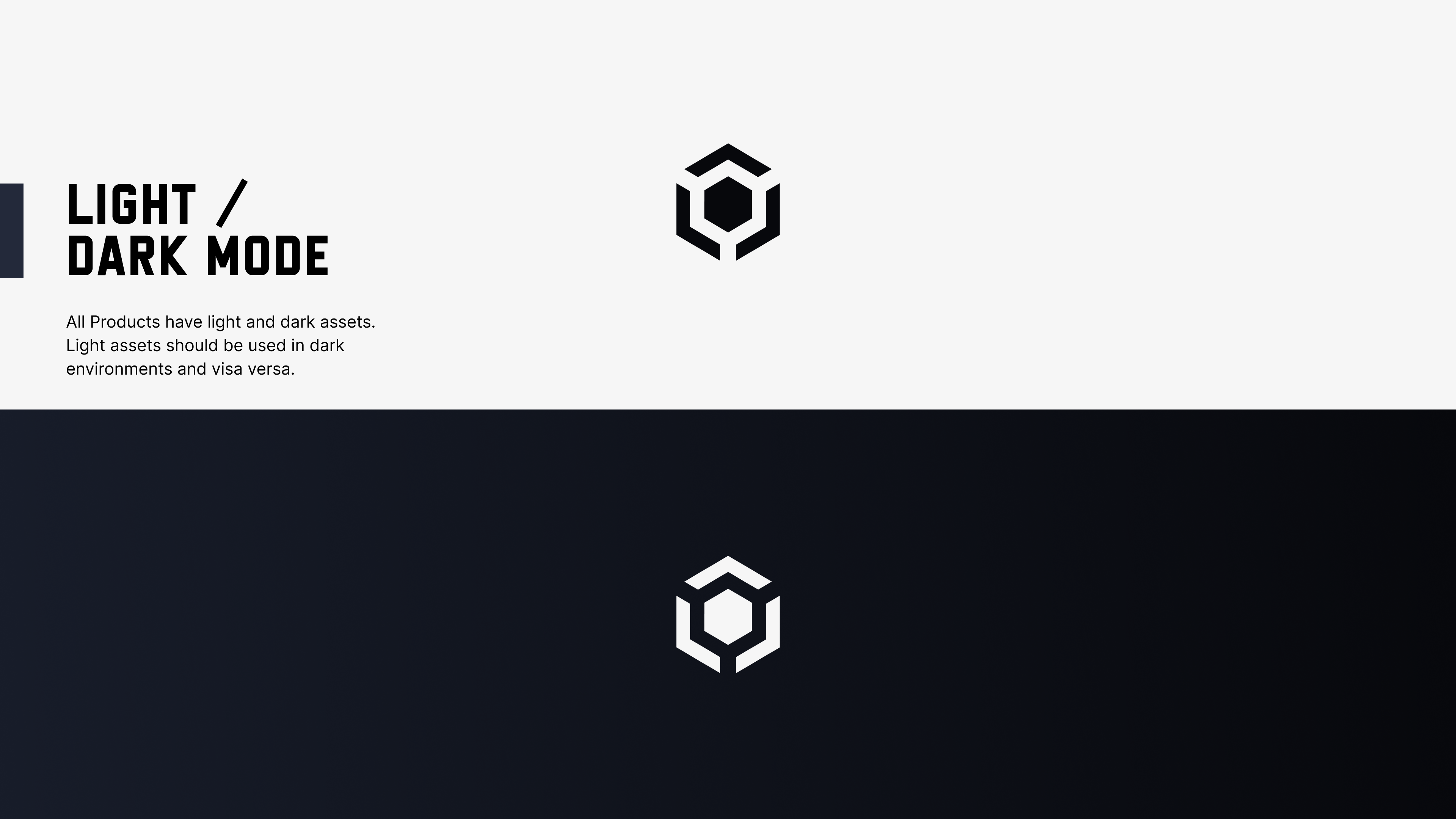
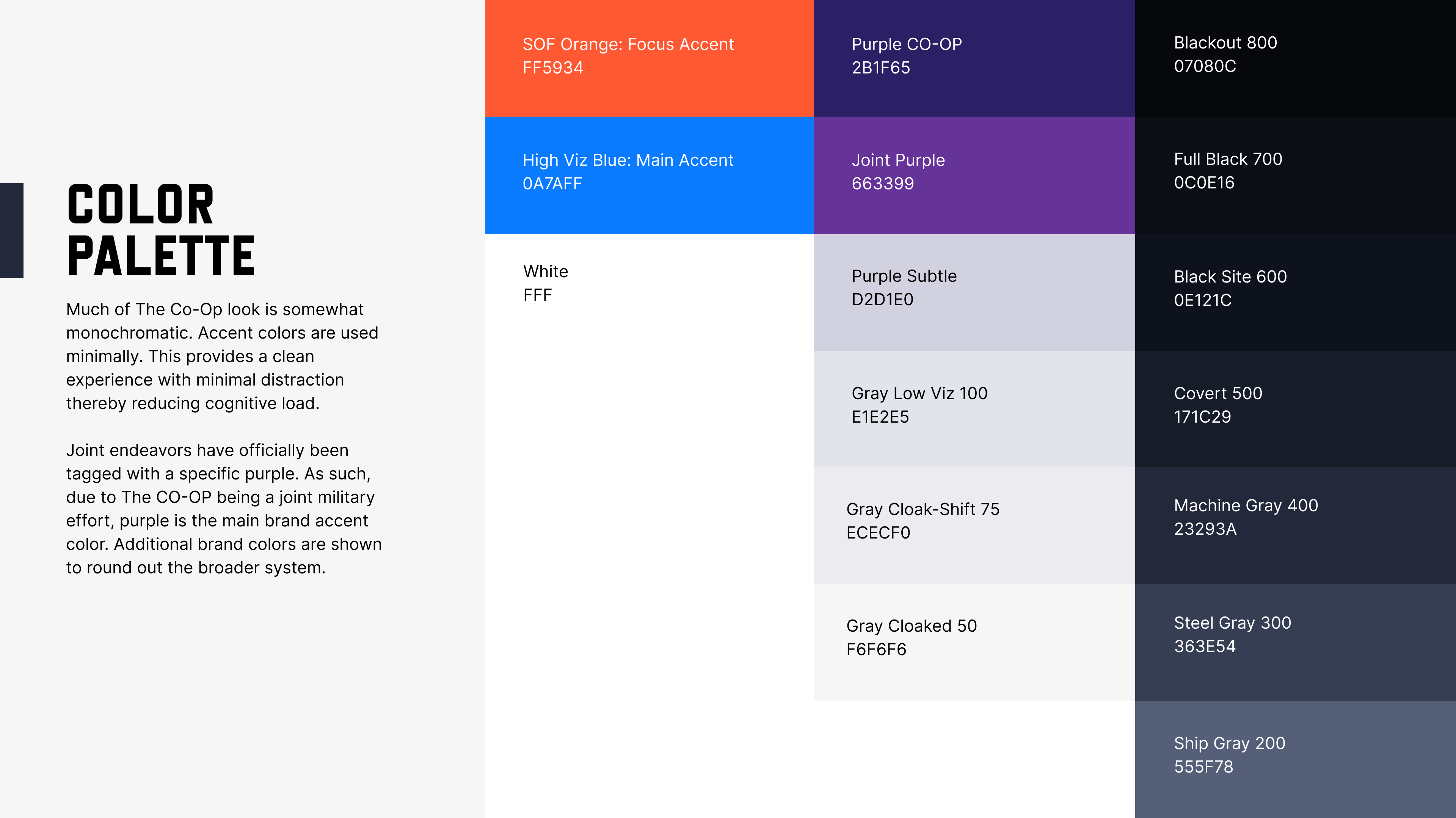
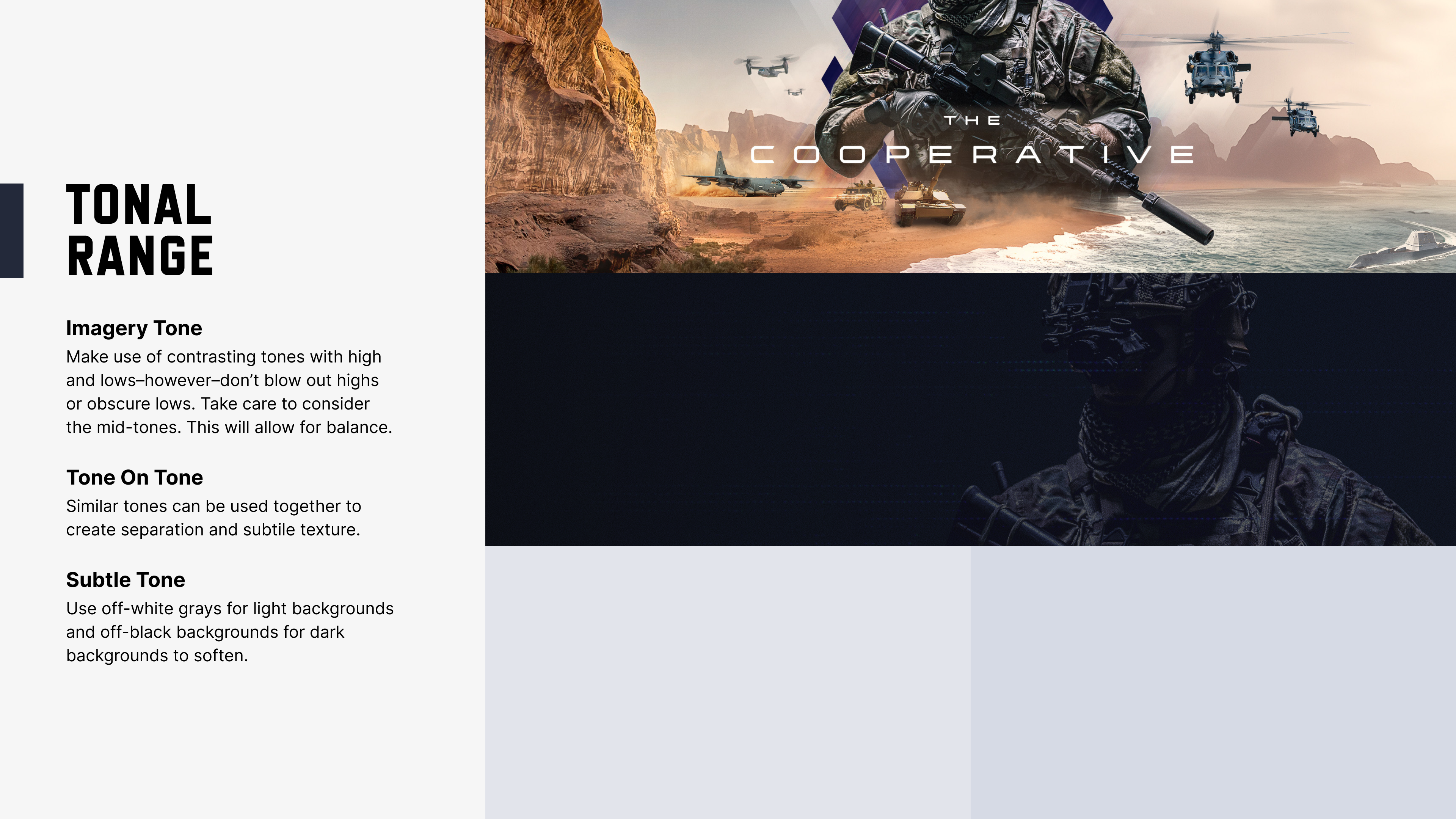
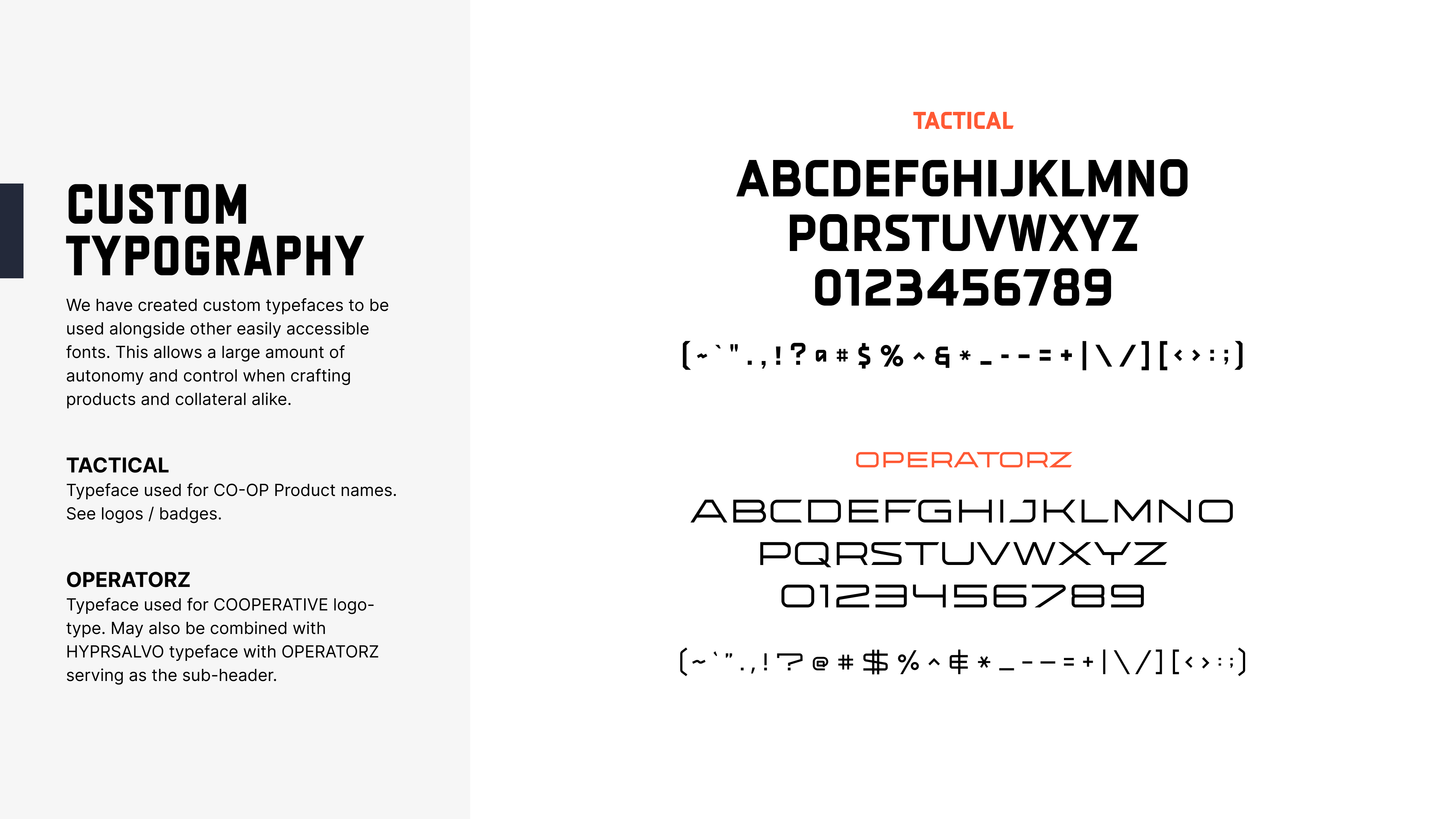
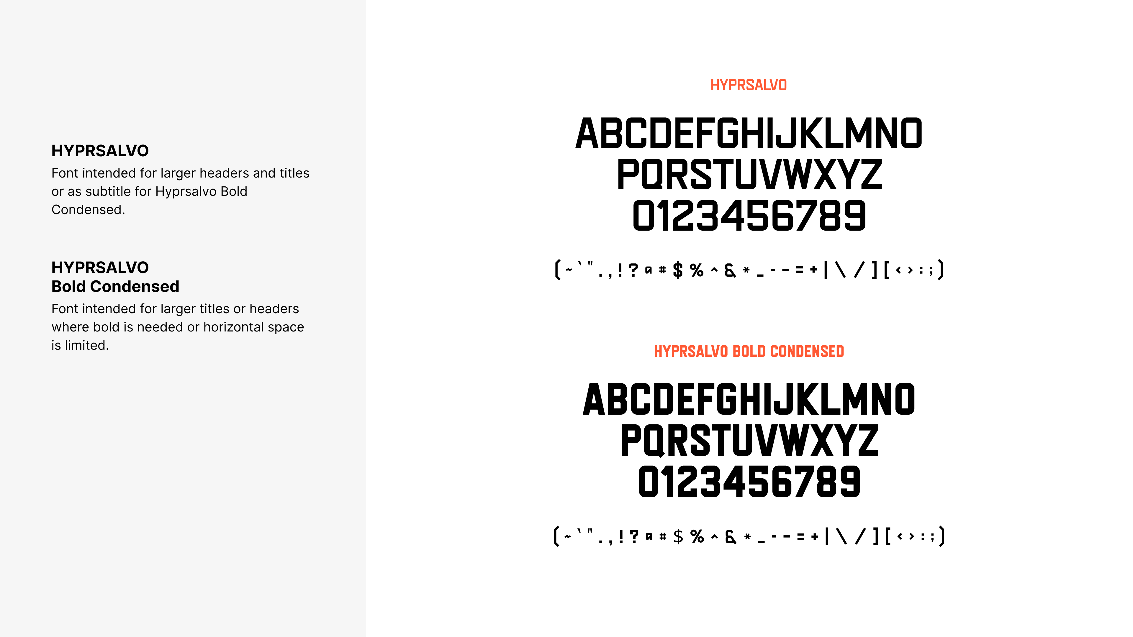
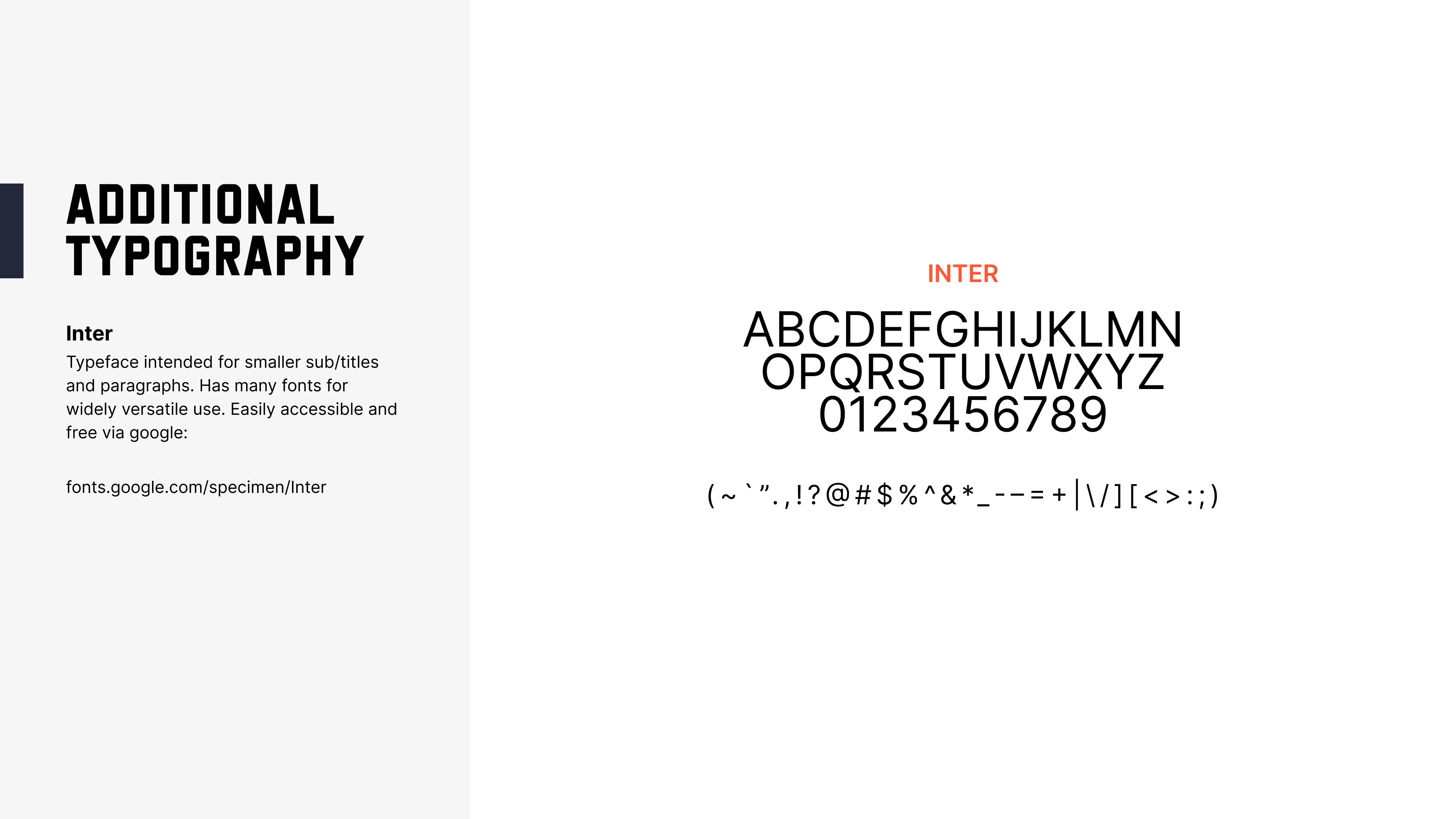
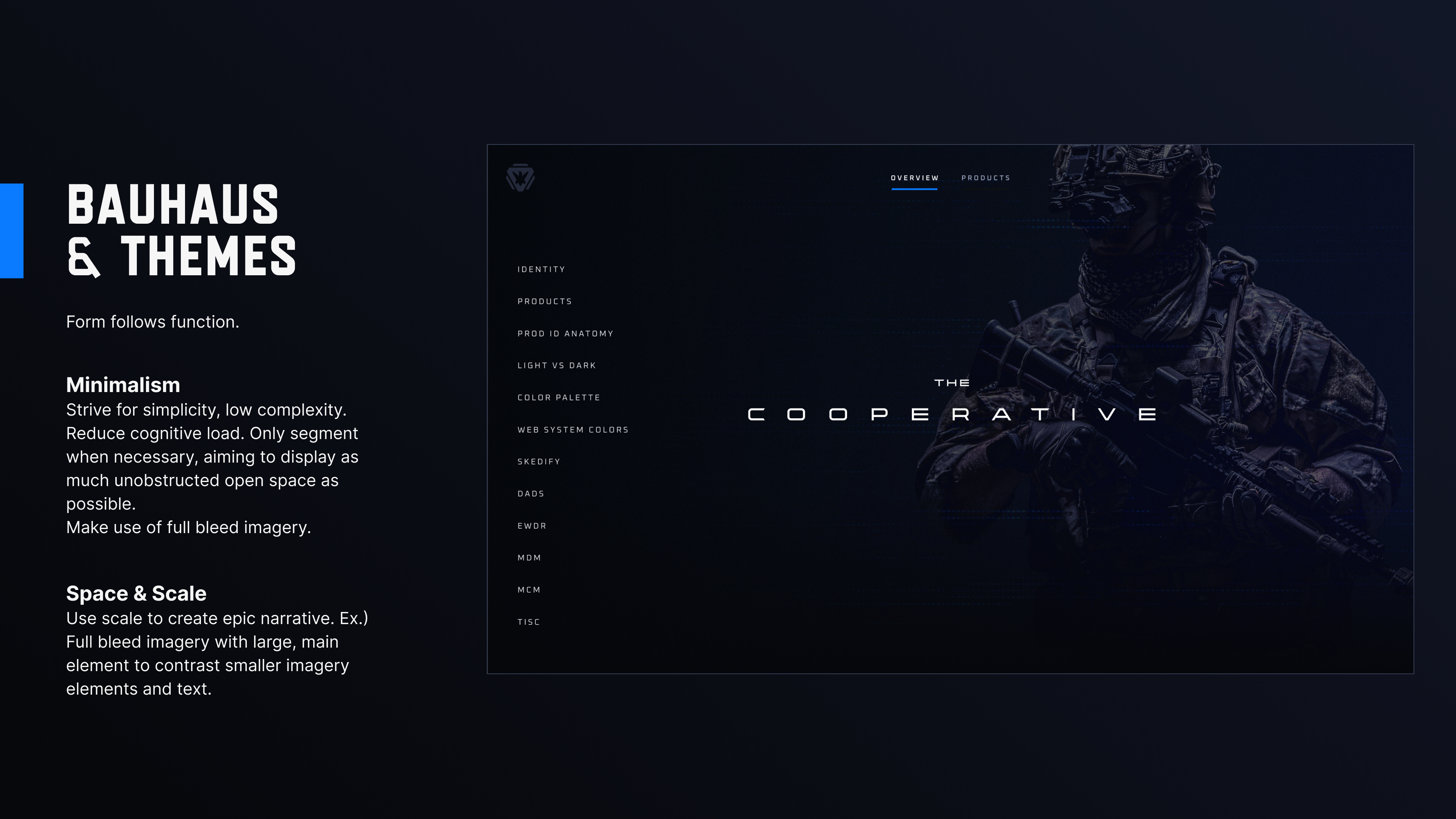
Once everything was established, I created a brand guide to explain everything and show the key points of the brand system.


Interactive UI
The prototype provided a unique way for the officials to view what is not normally an interactive experience. Branding is often displayed in a static way without the ability to use an interface to understand a new design system. It also made pitching the new designs much easier while at the same time incorporating the UI as part of the integration. With so many different products, it was helpful to display each separately but provide access which was only a click away.
Results and Impact
I presented the brand and provided an interactive prototype to Air Force officials with buy-in at the highest levels. The branding is being used to secure funding and further functionality for the designated suite of products.
