Special Operations Forces JTAC Manager
This is an interactive prototype I designed for updating a legacy version of the web app. The challenge was to effectively aid Joint Terminal Attack Controllers in recording mission reporting as upper management would need to view and assess quickly and easily to make informed decisions while limiting review time.
Discover
During discovery I interviewed key stakeholders for general understanding, taking stock of the legacy app, and key user insights. I learned about the different mission types and what types of recurring data we would need to capture. This would inform a templated design regardless of mission type and ensure the right app structure. The legacy entry process and resulting data was clunky and took up too much screen real estate.
Objectives
1. Understand daily JTAC workflows and readiness management needs.
2. Identify pain points in current tracking and reporting tools.
3. Map user roles and communication gaps across teams.
4. Evaluate how data is captured, shared, and visualized.
5. Define environmental constraints (speed, clarity, reliability).
Research
1. Conducted interviews regarding workflow challenges.
2. Audited existing workflow and tracking methods.
Insights
1. Users needed clarity, not more features.
2. The data captured needed to be better organized.
3. It took too long to enter data and submit reports.
Define & Develop
Problem Statement
"How might we make JTAC data entry fast, intuitive, and effortless under operational pressure?"
Workflows
The basic architecture and workflow for mission reporting.
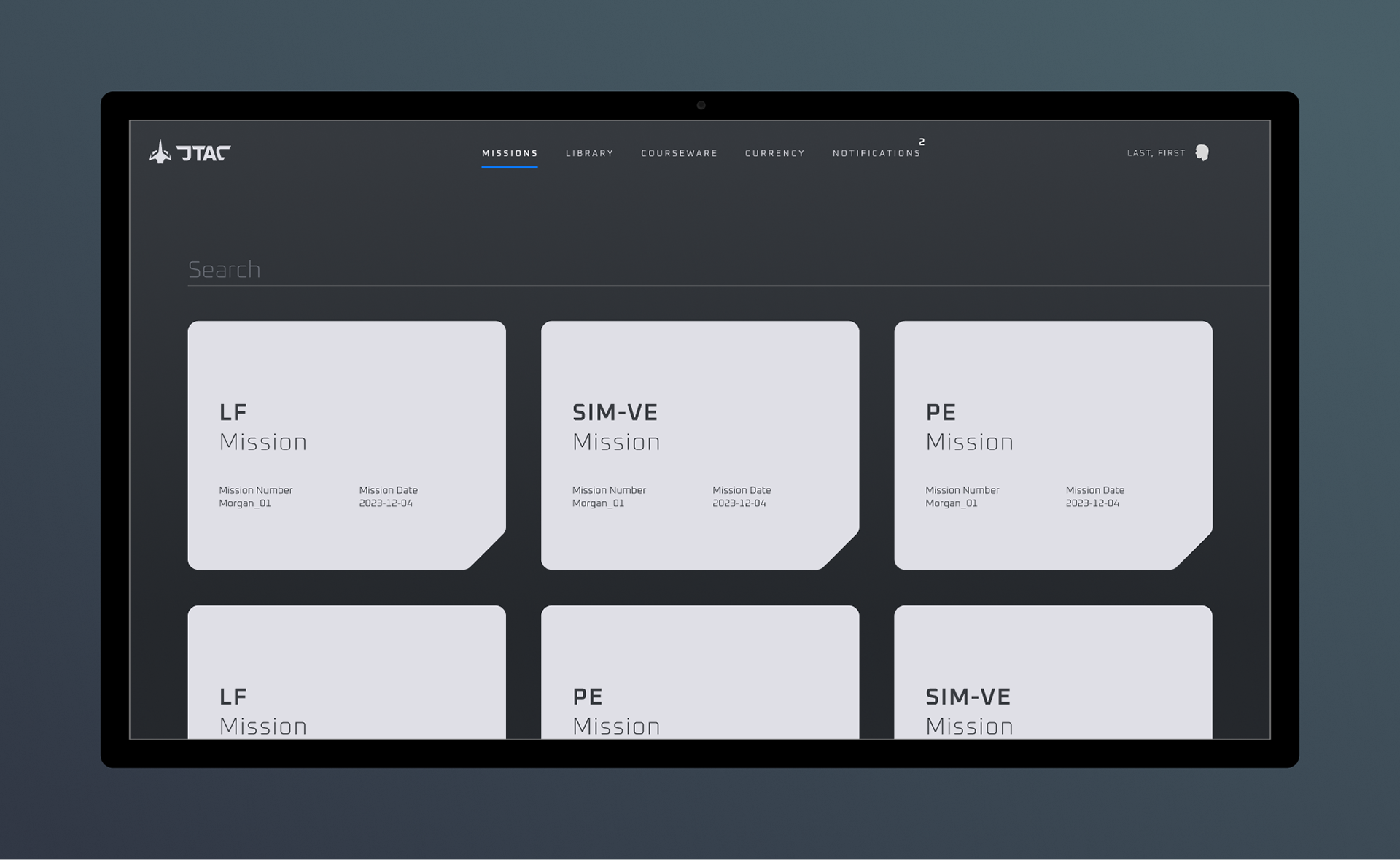
New Mission
A new mission can be added to the system by selecting 'Missions' which then gives the user a hover-state navigation menu with options for what type of mission to begin recording.
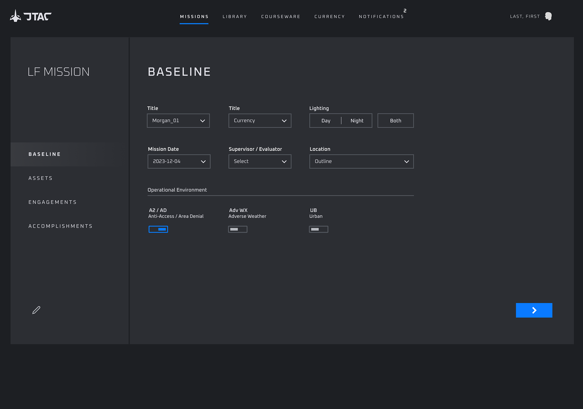
Baseline
The Operator enters basic, high-level data about the mission

Assets
One or more aircraft may be added. When selecting an airframe, an overlay appears with additional details regarding the craft. One reason for using an overlay for selecting additional data is to reduce cognitive overload by only showing relevant information when necessary and in the correct context. The user clearly knows where they are in the experience at all times with a manageable amount at data to scan and process at any given time.
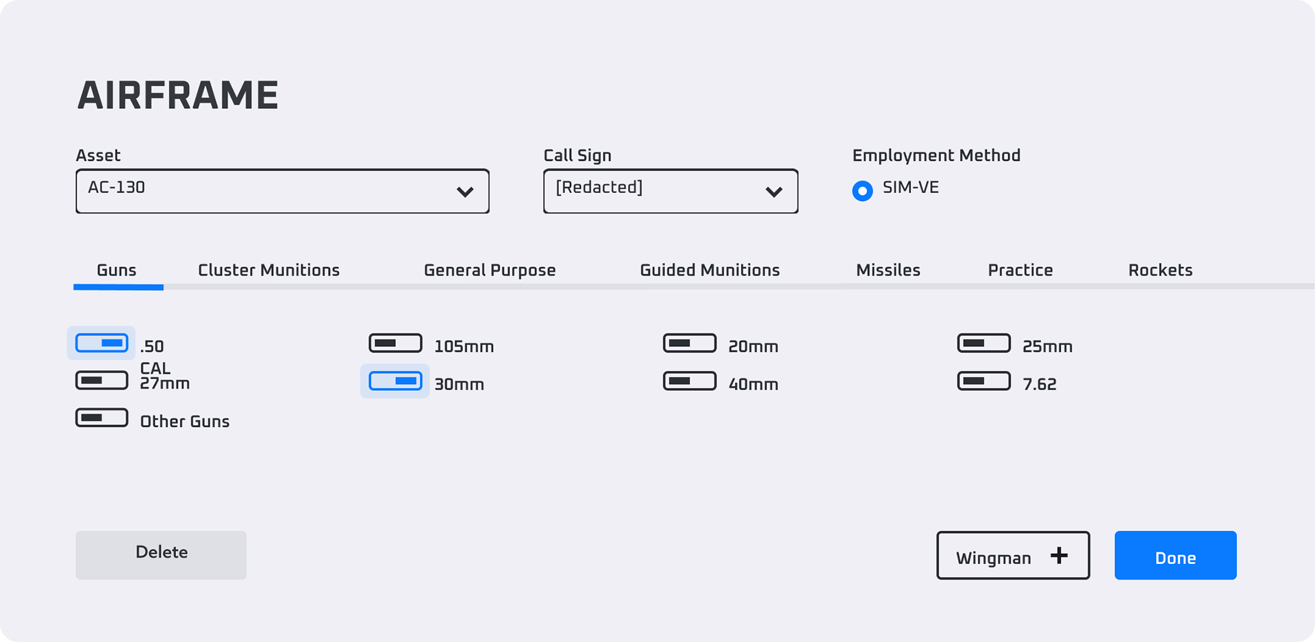
Additional navigation within the overlay UI keeps the user in even more control of only viewing data upon which is actively being focused. Some of the additional menu items may not be necessary to even view depending on events of the mission.
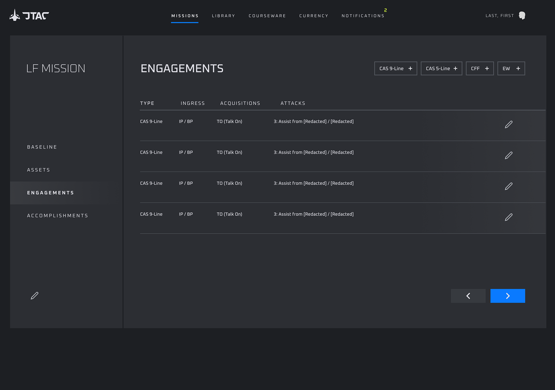
Engagements
Engagements are selected the same way the user has selected and airframe. Between drop-downs, toggles, radio buttons, and another navigation within the overlay–there is certainly plenty of information. Initially when designing this overlay specifically, I had to keep re-working the layout to accommodate all the data while also keeping everything fairly compact.
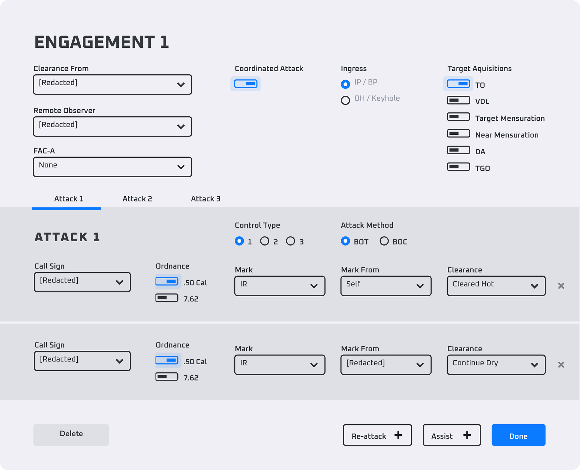
The card is broken down into two main sections. First, an engagement is defined. Secondly, each engagement may have one or more attacks. Additional re-attacks or assists may be selected from the bottom of the card. The UX is setup to handle as many re-attacks/assists as necessary. Navigating the legacy application of this same experience is cumbersome as there are many nested windows within each-other which can get chaotic fast.
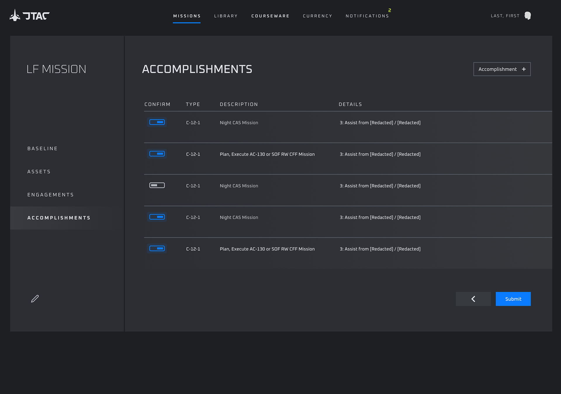
Accomplishments
After recording assets and engagements used, the idea of the accomplishments view is for the system to list all relevant accomplishments achieved during the mission. The Operator can toggle on/off any accomplishments the system got right or wrong, then submit their report. As opposed to the operator typing in all accomplishments by hand, compiling accomplishments based on information already in the system means huge time-savings for the user.